Ceci est une ancienne révision du document !
Table des matières
Syntaxe des extensions
Page en développement. ATTENTION, Tous les liens n'ont pas été mis-à-jour ! Ce sont encore des données bruts. Une boîte “information” sera placé à chaque plugin pour expliqué ce qui a été fait et ce qui reste à faire.
— MetallicaMust (discussion) le 01.04.2018 @ 15:02
DokuWiki utilise un langage de balisage simple, qui essaie de rendre les fichiers de données aussi lisibles que possible. Cette page contient toutes les syntaxes possibles offertes par les extensions. Regardez simplement le code source de cette page en cliquant sur le bouton Modifier cette page. Si vous souhaitez essayer quelque chose, rendez-vous dans la page du bac à sable. La page Syntaxe de mise en page vous informe sur les syntaxes de base. Les balises les plus simples sont également facilement accessibles depuis la barre d'outils de l'éditeur.
Info Plugin
Liens OK, reste à traduire.
~~INFO:keyword~~
- keyword can be one of:
- syntaxmodes — Displays the complete list of parser modes together with their getSort() values. See also syntax plugins.
- syntaxtypes — Displays which fr:devel:syntax_plugins#syntax types are used by available plugins. The syntax type determine which syntax may be nested.
- syntaxplugins — Displays a list of available syntax plugins.
- adminplugins — Displays a list of available admin plugins.
- actionplugins — Displays a list of available action plugins.
- rendererplugins — Displays a list of available render plugins.
- helperplugins — Displays a list of available helper plugins.
- helpermethods — Displays documentation of helper plugin class methods along with parameters and return values. One example of a helper plugin supporting this is fr:plugin:pagelist.
Random Include Plugin
Liens OK, reste à traduire.
Enclose the namespace from where to select the page in double curly brackets. Refer to Include plugin for detailed information here are only described the added functionallities.
{{randominc>[ns]#[section]&[flags]}}
| [ns] | namespace from which select the page to include |
|---|
The plugin offers two syntaxes, {{randominc>...}} and {{randomincsec>...}}.
randomincworks as Include plugin syntax of Include Plugin.randomincsecshould work as Include plugin syntax.
htmlmetatags plugin
Liens OK, reste à traduire.
With the string {{htmlmetatags>...}} on the page level you activate the plugin. The leading string “metatag-” marks a tag for the web site. After this leading string followed the key from tag. In =(...) write the value of the tag.
Also, the plugin is on page level.
Example to activate the plugin on your page write:
{{htmlmetatags>metatag-mytag=(some usefull text)}}
The meta tag: mytag is any word. This word is the name of the new meta tag, e.g. keyword. Followed on this name is to write = with ('...'). This brackets contains the text required for the value of the new meta tag.
You can write more than once meta tag on the page separate by space.
{{htmlmetatags>metatag-robots=()
metatag-keywords=(apfel,bananne,birne)
metatag-description=(Allgemeiner Obstbauer)
metatag-media-og:image=(:wiki:image.jpg)
metatag-og:description=(anything else)
metatag-og:any=(anything else 2)
}}
The result on web page is:
<meta name="robots" content="noindex,nofollow"/>
<meta name="keywords" content="apfel,bananne,birne"/>
<meta name="description" content="Allgemeiner Obstbauer"/>
<meta property="og:image" content="http://localhost/lib/exe/fetch.php?media=wiki:image.jpg"/>
<meta property="og:description" content="anything else"/>
<meta property="og:any" content="anything else 2"/>
Snippets Plugin
Usage
Liens et images, reste à traduire.
Create your snippets and then add them as an unordered list of links to the snippets_page, which is defined in the configuration manager and defaults to snippets. These are standard Dokuwiki internal links.
   * [[snippet_1|]]
   * [[snippet_2|General Instructions]]
   * [[snippet_3|Valid Users]]
However, if your snippet is derived from a namespace template, then you must use a special form of link which is described below in the section on using namespace templates as snippets.
Clicking on the snippets' icon will open the snippets pop-up window:

In the left-hand pane of the pop-up is the list of links derived from the snippets_page. In the right-hand pane is a preview of one of these. When there are two icons to the left of the link, clicking the left-most icon will insert the snippet into the preview pane. Clicking the right-hand icon will insert the snippet into the editing window at the current cursor location. Those links with only one icon are links to namespace template snippets. These cannot be previewed; therefore they have only the one icon which inserts the template into the editing window.
If you don't want this insertion to be updatable, uncheck the “Updatable” box. The box will remain unchecked for the remainder of the current session, unless manually re-checked.
When the updateable box is checked, the plugin is wrapped in a header and a footer which indicate that this instance of the snippet should be tracked and updated in the current page whenever the snippet is updated.
The header markup looks like this: ~~SNIPPET_O1423002180~~snippet_1~~, where the number is the timestamp for when the snippet was embedded in the page. This changes every time the snippet is updated. The footer looks like this: ~~SNIPPET_C~~snippet_1~~. snippet_1 is the Dokuwiki id of the snippet.
How the updates are processed
The plugin keeps a database that records the associations between snippets and the pages where they are embedded; in addition the meta file for each page containing snippets keeps a record of each snippet and its timestamp.
There are two ways that snippets are updated:
- When a page with a revised snippet is opened for revision, the revised snippet will automatically replace the old version in the editing window. For the change to become permanent, the page must be saved.
- When a snippet is revised, a table will appear at the bottom of its page with a listing of the pages that have used the snippet.
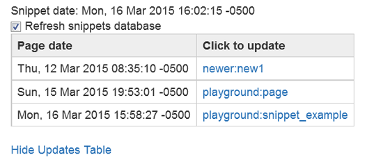
Each page name is a link. When clicked, it will update the snippet (and any other snippets) in the page named in the link. In addition, unused page ids assigned to the snippet will be pruned from the database, and the metafile for the page will be updated, unless the checkbox is un-checked.

For more details about the snippets plugin internals, see plugin:snippets:snippets_backend.
Admin: Metadata Clean-Up Tool
On the Administration Page, there is a tool which enables you to reconcile any differences between the information in the database and the content on the wiki pages. You will find it listed under “AdditionalPlugins”. This will be particularly useful if you remove snippets from your pages.
Inserting Comments into Snippets
You can use the following syntax inside your snippets to provide additional comments which will get stripped out when you insert the snippet into the page you are editing.
<snippet>
Additional comments, i.e. you have to provide the following information:

  * foo
  * bar
</snippet>
Namespace Templates as Snippets
Creating Links to Namespace Templates
Namespace templates can be used as snippets. There are two ways to do this:
- A standard namespace template is in included in a directory. In addition a dummy page beginning with
templ_must be included in this directory. When creating the listing of snippets, the dummy page must be listed as a snippet. When this page is selected, the template data will be inserted in its place and any content on it will be ignored. - Alternatively, a directory can be created with the word
templas its ending. That means that you can have a directory with the formtempland/orsomething_templ. Then a namespace template and a dummy file can be placed in this directory, and the dummy file will be used as described in (1) above.
In both cases the dummy file is used as the link in the snippets listing and when the link is clicked, the snippet is inserted into your page. There is one circumstance in which the contents of a dummy page is not ignored. This is where you activate the config:useheadings option, in which case the first heading will be used as the name of the link, if no other name is set in the link markup.
The following is a schematic for entering these snippets into the links on the snippets_page:
[[templ_admin|admin data]]
[[templ:policies|]]
[[distro_templ:start|distro data]]
[[:personal:templ_page]]
For [[:personal:templ_page]], we will assume that config:useheadings is active and its first heading is personal data. This will result in the following list of links:
admin data
policies
distro data
personal data
admin datawould access the dummy pagetempl_adminin the root namespace directory using the namespace template found in that directory.policieswould access the dummy pagepoliciesin thetempldirectory using the namespace template found in that directorydistro datawould access the dummystartpage in thedistro_templdirectory using the namespace template found in that directorypersona datalwould access the dummytempl_pagein thepersonaldirectory.
The dummy pages themselves are not changed. They are just placeholders.
These snippets are not updatable. The hidepages option can be used to exclude both pages beginning with templ_ and those using a templ directory by means of the following expression: templ:|templ_.
Replacement Patterns
Any replacement patterns that refer to page names, files and Dokuwiki ID's must have their @ characters changed to # characters, as follows:
| @ID@ | #ID# |
| @NS@ | #NS# |
| @FILE@ | #FILE# |
| @!FILE@ | #!FILE# |
| @!FILE!@ | #!FILE!# |
| @PAGE@ | #PAGE# |
| @!PAGE@ | #!PAGE# |
| @!!PAGE@ | #!!PAGE# |
| @!PAGE!@ | #!PAGE!# |
The other replacement patterns remain the same, @USER@, @DATE@, etc.
Bookcreator Plugin
Liens et images OK, reste à traduire.
Usage
Create book manage tools on wiki:ebook
Before using this plugin, you need to create a page with the bookmanager. Therefore you place the syntax ~~BOOK~~ in the wiki page wiki:ebook (in the configuration manager you can change this location).
In the bookmanager can show and manage your list of selected pages
- Reset current selection
- Exclude/include a page from selection (up to about 80 pages1))
- View the excluded pages and “include” them back
- Drag and drop to change exporting order of page and remove/add page to the selection.
- Set a title for the PDF document
- Create the PDF book on selected pages
- Create a printable version of selected pages
- Extract only text of selected pages
- Save and restore selections on a specific namespace (use ACL's rights)
Example
Put at the wiki:ebook the syntax:
~~BOOK~~
And after you mark at least one page for inclusion in the book, the bookmanager appears.

Initiate a book
 Use the Add/Remove to book link or button in your template to point a first page you like to add to a pdf book. The image on the left handside is the link as added automatically to the 'dokuwiki' template, see plugin:bookcreator#installation instruction below for other templates.
After selecting the first page, a toolbar appears on every page that let you add or remove additional pages. This toolbar refers also to the book manage tool.

The book manage tool that you created above (default on wiki:ebook) with ~~BOOK~~ let you reorder and exclude pages to your selection. Everybody who has access to the book manage tool can export selections to pdf, or show a print version. When you have enough (at least the “change”) ACL permissions in the namespace where the selections are saved, you can also save and select these selections.
Show saved selections
Below the bookmanager is a listed displayed with saved selections. You can also display with ~~ARCHIVEBOOK:number&sort~~ such a list of saved selections (books) anywhere into your wiki.
- Available action: Load a saved selection into the bookmanager again
- Optionally you can specify the number of selections to display and the order:
date– Sort by saving date of selectiontitle– Sort by Title of the selection- a number limits the number of displayed selections
Default is 10 items ordered by date (last updated are sorted first). Each entry links also to the wiki page where their selection is saved. Per page only one list of saved selections is displayed.
The user can only see selections when he has at least read access for the namespace wiki:ebook: (location configurable via config manager) or the pages in this namespace. Permissions for this namespace and the pages can be set as usual via the ACL manager.
Example
Lists 5 selections, sorted by date
~~ARCHIVEBOOK:5&date~~

talkpage plugin
Reste à traduire.
Simply add the macro Démarrer une discussion anywhere in your sidebar page.
Meta plugin
Liens OK. Reste à traduire.
Syntax
~~META:
key = value
~~
| key | the metadata element to set | required |
|---|---|---|
| value | the metadata element content | required |
You can set more than one element at once by using an & delimiter. Further, to set a child element, separate key and subkey with a space. Additional whitespace is allowed. Dates should be entered in the form YYYY-MM-DD hh:mm:ss. Two dates with an arrow (->) in between are considered as a period.
An example
~~META:
creator     = Esther Brunner
&date valid = 2006-04-15 -> 2006-10-15
~~
Data Structure
It is mandatory to use Dublin Core element names as keys for all metadata that might be interesting for external use. These are:
| Element | Child Elements | Type | Comments |
|---|---|---|---|
| title | — | string | will be used for window title and links if $conf['useheading'] is on; defaults to the first heading |
| creator | — | string | indicates the primary author of a page; defaults to the full name of the user who created the page |
| subject | — | string | used by the blog plugin / tag component: list of space separated tags; not set by default |
| description | tableofcontents, abstract | array | tableofcontents is an array of the TOC items with keys hid (header ID), title, type and level; abstract is 250 to 500 char raw text from the beginning of the page used for the RSS feed |
| publisher | — | string | not used |
| contributor | — | array | a list of all users who have made non-minor contributions to the page; every item has the user ID as key and the full name as value |
| date | created, valid, available, issued, modified | array | a timestamp (or an array of the timestamps start and end for a period); date created is filled with the creation date by default, date modified with the date of the last non-minor edit; the rest is not set by default |
| type | — | string | not set, but defaults to “text” when exported; recommended values are: collection, dataset, event, image, interactiveresource, movingimage, physicalobject, service, software, sound, stillimage or text |
| format | — | string | a MIME type is expected; not set, but defaults to “text/html” when exported |
| identifier | — | string | a unique ID of the page; not set, but defaults to the page ID when exported |
| source | — | string | not used |
| language | — | string | a two-letter language code is expected; not set, but defaults to the chosen language for DokuWiki when exported |
| relation | isversionof, hasversion, isreplacedby, replaces, isrequiredby, requires, ispartof, haspart, isreferencedby, references, isformatof, hasformat, conformsto | array | each of the child elements can contain a list of pages that stand in the indicated relation to the current page; the page ID serves as key, the existence of the page as value; in references, DokuWiki keeps track of which pages are linked by the current page; |
| coverage | spatial, temporal | array | not used |
| rights | accessrights, license | array | not set, but accessrights default to “public editable”, “public viewable” or “private” with respect to current ACL settings; license defaults to the Creative Commons license if set |
Box Plugin
Liens OK. Reste à traduire.
A simple box:
<box> the box contents </box>
Some more complex boxes
<box 80% round orange|a title> the box contents</box>
<box 50% left blue>the box contents</box|a caption>
<box 60% round #f99 #fc9 #fcc #f60|title>the box contents</box|caption>
The full syntax:
<box width classes colours | title text> contents text </box>
- width — any legal CSS width value
- classes — any number of classes which use the styles in your template or the plugin's own stylesheet to determine the look of the box. The box plugins comes with the following classes already defined:
- round — box will have rounded corners
- blue — blue colour scheme
- red — red colour scheme
- green — green colour scheme
- orange — orange colour scheme
- left — float the box left within the wiki page
- right — float the box right within the wiki page
if no classes are specified the default styles will be used, that is square corners in a colour scheme based on the default DokuWiki colour scheme.
- colours — 1-4 colours in CSS hex or RGB notation, e.g.
#F00 #fcab94 rgb(255,255,0). The colours are applied in order to:- content background
- title background
- outer box background
- borders
if less than four colours are specified, the first colour is used for the missing colours.
- title text — text (including DokuWiki markup) displayed above the box contents, with distinct style.
- caption text — text (no markup allowed) displayed below the box contents, with distinct style.
The opening <box … > including the title must all appear on one line. The box contents can appear over as many lines as are needed.
See the plugin in action here. The sample page shows all the styles available with the plugin.
Tag Plugin
Pas fait.
Components
Tag
{{tag>[list of tags]}}
| [list of tags] | a space separated list of tags that describe the content of the current page | required |
|---|
Allows you to categorize your wiki pages. The resulting links either point to the corresponding page in the specified tag namespace (only if it exists). If you want a link to point to a page in another namespace, you have to indicate the namespace before the tag name. If this page doesn't exist, just the list of pages with the same tag is shown when you follow one of those links.
Examples:
{{tag>tag1 tag2 tag3}}- with namespaces:
{{tag>ns1:tag1 ns1:tag2 ns2:subns1:tag3}} - multiple word tags:
{{tag>tag1_with_multiple_words tag2 tag3_part}}
Topic
{{topic>[tag]&[flags]}}
| [tag] | the category tag for which you want a list of pages | required |
|---|---|---|
| [flags] | pagelist flags delimited by &, see flags | optional |
This displays a list of all pages that contain the given category tag. The list is sorted alphabetically by page ID. You can also prepend the modifiers + and -. + creates an intersection between the list of pages created by the already defined tags and the pages matching the tag following the + (AND), - removes all pages tagged with the given tag from the list of already found pages.
Example:
{{topic>tag1 -tag2}}– Lists all pages tagged with tag1 but not with tag2.{{topic>tag1 +tag2}}– Lists all pages tagged with tag1 and tag2.{{topic>tag1 tag2}}– Lists all pages tagged with either tag1 or tag2 or both.{{topic>ns1?tag1 tag2}}– List all pages inside namespace ns1 tagged with either tag1 or tag2{{topic>.?tag1 tag2}}– List all pages inside the current namespace tagged with either tag1 or tag2{{topic>tag1 tag2 tag3&nodate&desc&sort}}(Adding pagelist options to change the design)
Searchtags
{{searchtags&[flags]}}
| [flags] | pagelist flags delimited by &, see flags | optional |
|---|
This displays a search form with the possibility to select a namespace and to select tags from a table of all tags that should either be in- or excluded with the option to choose if the tags should be associated with AND or OR. The results are displayed as in the topic component.
This is a great feature which you should not miss. Please add a screenshot of this cool feature. 
And you might check out TagFilter Plugin for similar purpose but in different scenarios.
Example:
{{searchtags}}– The basic syntax{{searchtags&nodate&desc&sort}}– with pagelist options to change the design
Count
{{count>[tag]}}
| [tag] | the category tag for which you want to list the occurrence | required |
|---|
This part allows you to display an overview of your current used tags. It prints the tag and the related occurrence (how often is the tag used?) in your wiki. Either you can specify a + as tag-name, which results in a list of all used tags or just specify some tags separated by spaces.
Example:
{{count>+}}– List all tags with related occurrences.{{count>tag1 tag2}}– List the occurrence of tag1 and tag2.{{count>tag1 tag2 tag3&. ns1 ns2}}– List all occurrences for the given tags inside the namespaces (the dot specifies the root namespace)
Tagpage
{{tagpage>[tag][&dynamic][|title]}}
This displays a link to the listing of all tags as it is done by the Tag syntax but without tagging the page with that tag. With the optional dynamic flag the link becomes red when the listing of all pages with that tag is empty for the current user. The dynamic flag automatically disables the cache of the current page in order to ensure that the link color is always correct. Optionally a title can be specified that will be used as link name.
Example:
{{tagpage>test_foo}}– The basic syntax{{tagpage>test_foo&dynamic}}– A link with dynamic link color{{tagpage>test_foo|my title}}– A link with custom title{{tagpage>test_foo&dynamic|my | title}}– A link with dynamic link color and custom title (that can also contain|)
Configuration
The plugin can be configured with the DokuWiki configuration manager available in the admin menu.
namespace | Namespace where the tag plugin looks for existing tag pages and links to them instead of the default tag overview. You could use the topic component to display the list of tags on such a page for example. (default tag) |
|---|---|
sortkey | Order in which tagged pages are sorted in the topic overview; available options are cdate as creation date, mdate as modification date, pagename, id as page ID, ns as namespace and title |
sortorder | Sort order of the topic overview. |
pagelist_flags | Comma separated Flags of the pagelist plugin which is used to display the topic overview |
toolbar_icon | Show icon in page editor toolbar to add tags. |
list_tags_of_subns | When counting tags in specified namespaces include also tags in subnamespaces. |
tags_list_css | Choose tags list style between standard or optimised for top of page position. |
Tagindex Rebuild
If the tag index becomes corrupted somehow (such as by using page move), then you can rebuild it by using the searchindex plugin or bin/indexer.php.
Demo / Screenshots


Translation Plugin
Usage
The plugin does its work automatically by being called from the template (see installation), but you can disable it for a certain page by adding the following code to the page:
~~NOTRANS~~
Namespace template variables
The translation plugin adds variables usable in Namespace Templates.
| Variable | Description | Example |
|---|---|---|
| @LANG@ | Language you have entered in your lang config | en |
| @TRANS@ | The currently used language. This variable will be empty, if your default language has no sub namespace. | en:start → en, start → <blank> |
Include plugin
Examples
{{page>wiki:syntax#Tables}} will include the section about tables of the syntax page.
{{namespace>project_foo}} will include all pages in the project_foo namespace.
{{page>blog:mypage&tags&comments}} will include the page blog:mypage and show the tags from the tag plugin and the number of comments from the discussion plugin. Both plugins need to be installed for this example.
{{tagtopic>testtag}} will include all pages with the tag testtag, the tag plugin plugin needs to be installed for this example.
Syntax
Simply enclose the ID of the page to be included in double curly brackets:
{{page>[id]&[flags]}}
{{section>[id]#[section]&[flags]}}
{{namespace>[namespace]#[section]&[flags]}}
{{tagtopic>[tag]&[flags]}}
| [id] | page ID of the page to include; some macros are possible; shortcuts are resolved (:, ., ..) | required |
|---|---|---|
| [section] | limits the included page to a specific section and its subsections | optional; default is the whole page , this can be used with namespace (if matches) |
| [tag] | include pages with tag topic tag, requires tag | required |
| [flags] | flags delimited by &, see flags | optional |
The plugin offers four syntaxes, {{page>...}} , {{section>...}} , {{namespace>...}} and {{tagtopic>...}}.
Section is aimed more at including sections, page at including whole pages and namespace at including whole namespaces. Tagtopic includes all pages with a tagtopic tag.
Configuration and Flags
The plugin can be configured in the DokuWiki configuration manager available in the admin menu. These settings also affect the blog plugin which uses the include plugin to generate the blog page. For most settings there are flags that allow to override the setting. Some features are only available as flag.
| Configuration option | Flags | Description |
|---|---|---|
noheader | noheader/ (show)header | Don't display the header of the inserted section |
firstseconly | firstsec(tion)only/ fullpage | Display only the first section of the included page |
readmore | readmore/noreadmore | Show “read more” link in case of firstsection only |
showtaglogos | - | Show/hide an image for the first tag (if the page has tags) |
showfooter | footer/nofooter | Show/hide page footer below the included page |
showlink | link/nolink | Makes the first headline of a included page/section a link to the included page/section |
showpermalink | permalink/ nopermalink | Show/hide a permalink to the included page in the page footer |
showdate | date/nodate | Show/hide creation date of the page in the page footer |
showmdate | mdate/nomdate | Show/hide modification date of the page in the page footer |
showuser | user/nouser | Show/hide user name of the page creator in the page footer |
showcomments | comments/nocomments | Show/hide number of comments in the page footer (requires the discussion plugin) |
showlinkbacks | linkbacks/nolinkbacks | Show/hide number of linkbacks in the page footer (requires the linkback or backlinks2 plugin) |
showtags | tags/notags | Show/hide tags in the page footer (requires the tag plugin) |
showeditbtn | editbtn or editbutton/noeditbtn or noeditbutton | Show/hide edit button below the included page |
doredirect | redirect/noredirect | Redirect back to original page after an edit |
usernamespace | - | Namespace for user pages (see showuser configuration) (default user) |
doindent | indent/noindent | Indent included pages relative to the section of the page they get included in |
linkonly | linkonly/nolinkonly or include_content | Display only a link instead of the whole page content |
title | title/notitle | Show the title instead of the page id |
pageexists | pageexists/ nopageexists | Only list page ids of existing pages (see existlink) |
| - | existlink | Display a link and do so only if page page-id exists (combination of linkonly and pageexists) |
parlink | parlink/noparlink | (Don't) put the link into a paragraph environment (for inline lists) |
order | order=OPTION | Ordering criteria for namespace includes, possible options: page ID (id), title (title), date created (created), date modified (modified), indexmenu sort order (indexmenu), custom sort order using the {{include_n>[number]}} on the pages that are included similar to the indexmenu tags (custom). |
rsort | rsort/sort | Reverse the sort order in namespace includes. |
depth | depth=DEPTH | The maximum depth of subnamespaces of which pages are included in namespace includes, default is 1 for only the specified namespace, 0 is for unlimited depth. |
| - | inline | Don't close/open sections when including a page. This flag should be used when the include syntax is used inside other syntax elements like lists or tables or inside other plugin syntax. |
| - | beforeeach=ENTITY/ aftereach=ENTITY | Display an entity before/after each included page. The entity is printed outside the section/include environment, this is mainly for adding custom HTML code (when the text isn't recognized as entity it is directly displayed but escaped so you can't directly use HTML code here). |
safeindex | - | Don't index metadata of included pages that are non-public. This can cause problems with other plugins that use the metadata index and can be safely disabled in wikis where the permissions of the included pages match the permissions of the parent pages. |
Examples:
{{page>concept&firstseconly&footer}}
{{page>mypage&noindent}}
{{namespace>myns&order=modified}}
Macros
Simple macros are possible to serve a page on a per user or per date base. These are:
| @USER@ | username |
|---|---|
| @NAME@ | full name of user |
| @GROUP@ | first group the user belongs to |
| @YEAR@ | 4-digit year |
| @MONTH@ | 2-digit month |
| @WEEK@ | 2-digit ISO week number |
| @DAY@ | 2-digit day |
| @DATE<expr>@ | use a calculated date instead of today in date macros |
<expr> in @DATE<expr>@ can be one of:
| PYEAR | previous year |
|---|---|
| NYEAR | next year |
| PMONTH | previous month |
| NMONTH | next month |
| PWEEK | previous week |
| NWEEK | next week |
| YESTERDAY | yesterday's date |
| TOMORROW | tomorrow's date |
Examples:
{{page>@MONTH@:@DAY@:birthdays}}
includes the page birthdays in namespace <month>:<day>: eg. 10:15: birthdays for the 15th of october.
{{page>@USER@:message}}
incudes the page message from the namespace <user> of the logged in user
{{page>foo@DATENWEEK@@YEAR@:@WEEK@}}
includes the page <weekno> from the namespace foo<year> with next week's date e.g. foo2012:01 for the 27th of december 2011
Dw2Pdf plugin
Usage
There are three ways to export:
- Export one page
You simply need to call the page with an additionaldo=export_pdfURL parameter. This starts the PDF export of the page. Some templates let the plugin extend the pagetools automatically. For other templates you need to implement this yourself to add a button or similar somewhere in your template design. - Export an entire namespace
There is the URL parameterdo=export_pdfnswhich let you export a chosen entire namespace as one PDF. Create a link with the syntax. - Export selection of pages
If you need to select just some pages to export to one PDF, you can use Bookcreator plugin, which offers an interface for the dw2pdf plugin.
Syntax
To create a link in any wiki page to export any namespace, you can use the following syntax:
~~PDFNS>namespace|pdftitle~~
namespaceis the namespace you want to exportpdftitleis the title of the generated output PDF- You can add further options (like
&book_order=pagename) by simply appending them to the pdftitle.
Handling of startpages: If the page <namespace>:start doesn't exist, it checks if the page with the name <namespace> exists and will add to the pdf as well.
Open Document Plugin
Usage
To make a single page exportable you can add the following macro to the page:
~~ODT~~
A better way is to integrate an export button into your template.
If you use the default template just switch the button on in the configuration menu.
Otherwise use the following to add another button in the upper or bottom button row of the template2)
<form class="button" method="get" action="<?php wl($ID)?>">
    <div class="no">
        <input type="submit" value="Export to ODT" class="button" />
        <input type="hidden" name="do" value="export_odt" />
        <input type="hidden" name="id" value="<?php echo $ID?>" />
    </div>
</form>
Or use this for a simple 16×16 icon somewhere in your template:
<a href="<?php echo exportlink($ID, 'odt')?>"><img src="<?php echo DOKU_BASE?>lib/images/fileicons/odt.png" alt="ODT Export" /></a>
You can mix the 2 previous methods, and get a button with an image inside, with this code:
<form class="button" method="get" action="<?php wl($ID)?>">
    <div class="no">
        <button type="submit" class="button">
            <img src="<?php echo DOKU_BASE?>lib/images/fileicons/odt.png" alt="ODT Export" />
           Export to ODT
        </button>
        <input type="hidden" name="do" value="export_odt" />
        <input type="hidden" name="rev" value="<?php global $REV; echo $REV?>" />
        <input type="hidden" name="id" value="<?php echo $ID?>" />
    </div>
</form>
Additional syntax tags
There are some syntax tags for additional features which can not be set in the configuration alone because e.g. the position matters or to provide more flexibility. These tags are described in this section.
pagebreak
A manual pagebreak can be inserted by adding the syntax tag <pagebreak> in the wiki page. This feature requires the Pagebreak Plugin.
page
The syntax tag page can be used to set the page format, orientation and margins with one single command. The format is the following:
{{odt>page:format,orientation,margin_top,margin_right,margin_bottom,margin_left}}
The following example sets the page format A3, orientation landscape and all margins to 1 centimeter.
{{odt>page:A3,landscape,1,1,1,1}}
You can also omit parameters that you do not want to change, e.g.:
{{odt>page:A3,landscape}}
That changes the page format and orientation but not the margins.
If you want to alter a single page property only, then you can use the settings tags for format, orientation or the margins alone. See some examples below:
{{odt>format:A3}}
{{odt>format:A4}}

{{odt>orientation:portrait}}
{{odt>orientation:landscape}}

{{odt>margin_top:1}}
{{odt>margin_right:2}}
{{odt>margin_left:3}}
{{odt>margin_bottom:4}}
A change of the page format will finish the current page, cause a pagebreak and the next page will then use the newly set page format.
toc
The toc syntax tag can be used to insert a table of contents at the position of the tag. Without inserting the toc syntax tag, no table of contents will be created at all. The minimum syntax is:
{{odt>toc}}
This will create a table of contents with all relevant settings taken from the ODT plugin configuration. The title will be 'Table of Contents' (depending on the language set).
The following options for the toc syntax tag do exist:
- maxlevel: this overwrites toc_maxlevel
- title: this overwrites the language specific default title 'Table Of Contents'
- leader_sign: this overwrites toc_leader_sign
- indents: this overwrites toc_indents
- pagebreak: this overwrites toc_pagebreak
- styleH: this overwrites the Contents Heading style in the styles.xml file
- styleL1 … styleLN: N = maxlevel, overwrites toc_style
These have all the same meaning as the corresponding configuration settings. Only exception is styleL1 … styleLN. The configuration setting toc_style sets the style for the whole table of contents. styleL1 only sets the style for toc level 1, styleL2 only sets the style for toc level 2…
The option syntaxH works the same way as the styleL option above but sets the style for the table of contents heading.
All these options are optional. If you omit one, then the corresponding setting of the configuration (or URL request parameter) will be used. Every option needs to be finished with a ; .
Here are some examples (all one line):
{{odt>toc:title=Content;leader_sign=.;indents=0,0.5,1;pagebreak=true;
styleL1="font-weight:bold;";styleL2="font-style:italic;";
styleL3="font-style:normal;";}}
{{odt>toc:title=Content;leader_sign=_;indents=0,2,2;pagebreak=false;
styleL1="font-weight:bold;";styleL2="font-style:normal;";
styleL3="font-style:normal;";}}
chapter-index
The chapter-index syntax tag can be used to insert a chapter-index at the position of the tag. Without inserting the chapter-index syntax tag, no chapter indexes will be created at all. The minimum syntax is:
{{odt>chapter-index}}
This will create a chapter-index with all relevant settings taken from the ODT plugin configuration for the table of contents. By default the chapter-index will have no title.
The options for the chapter-index syntax tag are the same as for the toc syntax tag.
disablelinks/enablelinks
These tags enable or disable link creation just like the configuration setting. Here is the syntax:
{{odt>disablelinks}}
{{odt>enablelinks}}
templatepage
This tag can be used to specify a wiki page as a CSS template. That means all content from the page is imported as CSS code. Example:
{{odt>templatepage:mycsspage}}
It is totally fine if the CSS code in the templatepage is surrounded by <code css>…</code> tags to improve readability.
This feature enables the user to use a CSS template without the need of uploading any files. ATTENTION: using a template page may overwrite already imported style settings from an ODT or CSS template file.
frame-open/frame-close
These tags insert the content between them inside an ODT frame on export to ODT. The HTML view is not changed. Here is the syntax:
{{odt>frame-open:...options...}}
{{odt>frame-close}}
Putting content in a frame can e.g be used to position that content on a fixed point of the page. This e.g. can be useful for writing letters.
See details on using ODT frames for more information.
: create page, describe frame usage in detail
Gallery Plugin
Syntax
A basic gallery can be added by selecting a namespace like this:
{{gallery>:namespace}}
All image files in the selected namespace will be added to the image gallery. Don't forget the “:” in front of the namespace.
Instead of using a whole namespace of images, you can also specify a single image – this makes more sense when combined with the lightbox mode (see below).
{{gallery>:namespace:someimage.jpg}}
The created gallery can be aligned by using white space (defaults to centered):
{{gallery> namespace}} (right aligned)
{{gallery>namespace }} (left aligned)
{{gallery> namespace }} (centered)
Instead of a namespace, you can also give an HTTP(s) URL to any Media RSS or ATOM feed with enclosures (as produced by most photo sharing sites like Flickr). The images will then be pulled from that feed instead:
{{gallery>http://www.23hq.com/rss/schabloni}}
Note: since the question mark is used to separate the parameters (see next section) the URL can not contain any question mark. To use such a feed URL with the gallery plugin, just use one of the many short URL services like http://bit.ly.
E.g. instead of http://api.flickr.com/services/feeds/photos_public.gne?id=22019303@N00&lang=en-us&format=rss_200 use a shortened URL like http://bit.ly/HurZM.
Additionally, to have thumbnail creation correctly working you need to set fetchsize big enough to get the remote images downloaded.
Parameters
A number of parameters can be set by appending them with ? character to the namespace or image. Each parameter needs to be separated with a & character. Defaults for all parameters can be set in the config manager. If a parameter is enabled by default it can be disabled in the syntax by prefixing it with the syllable no. E.g. the parameter cache is usually enabled and can be disabled using the keyword nocache. Below is a list of all recognized parameters
| Parameter | Default | Description |
|---|---|---|
<number>x<number> | 120x120 | Sets the size for thumbnails. Unless the crop option is set, this is a boundary box into which the thumbnail will be fitted, maintaining the correct aspect ratio. |
<number>X<number> | 800X600 | Sets the size for the linked images in direct mode. This is a boundary box into which the image will be fitted, maintaining the correct aspect ratio. Note the uppercase X. |
<number> | 5 | The number images per row in the gallery table. If you specify a 0 no table is used instead all thumbnails are added in a sequence. |
=<number> | =0 | Limits the output to the given number of images. 0 means all. |
+<number> | +0 | Skip the first number of images. Useful with the option above. |
~<number> | ~0 | Add a pagination for the thumbnails displaying the number of given thumbnails per page. 0 disables pagination. Pagination is added through JavaScript - when no JavaScript is available all thumbnails are displayed |
cache | enabled | Usually the output of the created gallery is cached. When the images in your selected namespace change, you have to manually force an update of the gallery page's cache. To disable the cache for the page showing the gallery, set nocache as option. |
crop | disabled | Make thumbnails the exact given thumbnail size big, cropping when needed. |
direct | disabled | Link thumbnails with the bigger sized images not with their detail page |
lightbox | disabled | Show images in a fancy JavaScript modal browsing window, see below for details. Setting this option automatically implies the direct mode |
reverse | disabled | Reverse the order of the displayed images |
recursive | enabled | Find images in the given namespace and all sub namespaces |
random | disabled | Sort images randomly. You might want to use nocache as well |
modsort | disabled | Sort images by file modification date |
datesort | disabled | Sort images by EXIF date |
titlesort | disabled | Sort images by EXIF title |
showname | disabled | Show filename below thumbnails |
showtitle | disabled | Show the EXIF tag Headline as title below thumbnails |
anything containing a * | jpg,gif,png images | This can be used to filter the list of files found in the given namespace. * work as simple wildcard symbol. |
Example
{{gallery>images:vacation?image_*.jpg&80x80&crop&lightbox}}
This displays all images beginning with image_ and ending in .jpg from the namespace images:vacation. Thumbnails are cropped to 80×80 pixels and images will be opened in lightbox mode.
Example
{{gallery>?crop&lightbox}}
This displays all images in the current namespace using 2 parameters. Parameterlist begins with ? additional ones are concatenated with &.
Wrap Plugin
Image OK, reste à traduire.
Syntax
Basic Syntax:
<WRAP classes #id width :language>
"big" content
</WRAP>

**or**
<block classes #id width :language>
"big" content
</block>

or
<div classes #id width :language>
"big" content
</div>
An uppercase <WRAP> (or alternatively <block> or <div>) creates a div and should be used for “big” containers, surrounding paragraphs, lists, tables, etc.
<wrap classes #id width :language>"small" content</wrap>

or
<inline classes #id width :language>"small" content</inline>

or
<span classes #id width :language>"small" content</span>
A lowercase <wrap> (or alternatively <inline> or <span>) creates a span and should be used for “small” containers, inside paragraphs, lists, tables, etc.
Since version 2013-06-13 there is also a shorthand syntax (for wraps without content):
<WRAP classes #id /> or <block classes #id /> or <div classes #id />
and
<wrap classes #id /> or <inline classes #id /> or <span classes #id />
 Please note, some things won't work with spans: alignments (including alignments generated by changing the text direction), multi-columns and widths if the according wrap isn't floated as well.
Examples
The plugin comes with an example page, which should explain a lot and looks like this in the default template (see below).
Classes
The following classes are currently available:

| class name | description/notes |
|---|---|
| columns – similar to columns, side_note, styler, tip | |
column | same as left in LTR languages and same as right in RTL languages |
left | same as column, will let you float your container on the left |
right | will let the container float right |
center | will position the container in the horizontal center of the page |
col2..col5 | will show the text in multiple columns (2, 3, 4 or 5), only works in modern browsers (Firefox, Chrome and Safari) |
| widths – experimental, might not work as expected, includes mobile support |
|
half | fits two columns in a row, should be used in pairs |
third | fits three columns in a row, should be used in triplets |
quarter | fits four columns in a row, should be used in quads |
| alignments – similar to divalign, columns, styler – don't work with spans! |
|
leftalign | aligns text on the left |
rightalign | aligns text on the right |
centeralign | centers the text |
justify | justifies the text |
| boxes and notes – similar to box, note, tip | |
box | creates a box around the container (uses colours from style.ini) |
info (was information in first version) | creates a blue box with an info icon |
important | creates an orange box with an important icon |
alert ( was warning in previous versions) | creates a red box with an alert icon |
tip | creates a yellow box with a tip icon |
help | creates a violet box with a help icon |
todo | creates a cyan box with an todo icon |
download | creates a green box with a download icon |
round | adds rounded corners to any container with a background colour or a border (only works in modern browsers, i.e. no IE) |
danger | creates a red danger safety note |
warning | creates an orange warning safety note |
caution | creates a yellow caution safety note |
notice | creates a blue notice safety note |
safety | creates a green safety note |
| marks – similar to emphasis, important_paragraf, importanttext | |
hi | marks text as highlighted |
lo | marks text as less significant |
em | marks text as especially emphasised |
| miscellaneous | |
clear | similar to clearfloat, should preferably be used with divs, i.e. uppercase <WRAP>s |
tabs | if wrapped around a list of links, will show those as tabs |
hide | hides the text per CSS (the text will still appear in the source code, in non-modern browsers and is searchable) |
noprint | displays text on the screen, but not in print, similar to noprint |
onlyprint | displays text only in print, but not on the screen |
pagebreak | forces a new page in printouts (not visible on the screen), similar to pagebreak |
nopagebreak | tries to avoid a pagebreak in printouts (not visible on the screen) |
spoiler | shows white text on a white background, only to be revealed by highlighting it; similar to hide |
button | when wrapped around a link, styles it like a button |
indent | indents the text, could be used instead of tab |
outdent | “outdents” the text, could partly be used instead of outdent |
prewrap | wraps text inside pre-formatted code blocks, similar to wpre |
All tables inside a column or box will always be 100% wide. This makes positioning and sizing tables possible and partly replaces tablewidth.
Known restrictions
- WRAPs won't export in ODT format.
- Round corners only work in modern browsers (no IE8 and below).
- Multiple columns only work in modern browsers (no IE9 and below).
- Width classes are experimental and only work in modern browsers (no IE8 and below).
- Normal DokuWiki Headlines used to not work and a work-around was added. Now that headlines do work, the work-around is not needed anymore but kept for backwards-compatibility. The following syntax would produce two different kinds of emulated headlines inside any of the columns or boxes/notes:
- //**__Big Underlined Headline__**// (They will look a bit different in safety notes.)
- //**Small Headline**//
You might need to adjust a few of the classes to your template's needs, especially hi, lo and em. If you have a dark or otherwise heavily coloured theme, please use the darkTpl config option.
The classes are easily adjustable and extensible. Any wishes are welcome.
Widths
You can set any valid widths on any uppercase <WRAP> container: %, px, em, ex, pt, pc, cm, mm, in. Just set the width before or after or with the classes, e.g.
<WRAP someclass 50% anotherclass>...
All except percentages will be reduced to have the maximum width available on smaller screens.
You can also use the width keywords half, third and quarter. To work correctly they need another wrap around them. E.g.
<WRAP group>
  <WRAP half column>...</WRAP>
  <WRAP half column>...</WRAP>
</WRAP>
will result in two columns next to each other, which will wrap underneath each other on smaller screens and mobile devices.
Languages and Text Directions
You can change the language and the direction of a container by simply adding a colon followed by the language code, like this:
<wrap :en>This text is explicitly marked as English.</wrap>
The text direction (rtl, right to left or ltr, left to right) will get inserted automatically and is solely dependent on the language. The list of currently supported languages is taken from: http://meta.wikimedia.org/wiki/Template:List_of_language_names_ordered_by_code
If you like to mark a text with a different text direction than the default one, you should use divs, i.e. uppercase <WRAP>s. Otherwise the text alignment won't change as well.
/lib/tpl/default/main.php, there are two divs that contain some buttons: <div class="bar" id="bar__top"> and <div class="bar" id="bar__bottom">. Just insert the HTML code inside one of the two divs (left or right)